;%20}%20.cls-3%20{%20fill:%20%23fff;%20}%20.cls-4%20{%20clip-path:%20url(%23clippath);%20}%20%3c/style%3e%3cclipPath%20id='clippath'%3e%3crect%20class='cls-1'%20width='258.34'%20height='83.22'/%3e%3c/clipPath%3e%3cclipPath%20id='clippath-1'%3e%3crect%20class='cls-1'%20y='0'%20width='258.34'%20height='83.22'/%3e%3c/clipPath%3e%3c/defs%3e%3cg%20id='LHC_logo_main_white'%3e%3cg%20class='cls-4'%3e%3cpolygon%20class='cls-3'%20points='36.78%2056.65%2036.78%2061.85%2021.08%2061.85%2021.08%2021.27%2026.27%2021.27%2026.27%2056.65%2036.78%2056.65'/%3e%3cg%20class='cls-2'%3e%3cpath%20class='cls-3'%20d='M61.22,21.33v29.38c0,6.12-4.95,11.1-11.04,11.1s-11.1-4.98-11.1-11.1v-29.38h5.2v29.38c0,3.25,2.65,5.9,5.89,5.9s5.85-2.65,5.85-5.9v-29.38h5.19Z'/%3e%3cpolygon%20class='cls-3'%20points='96.44%2021.33%2096.44%2061.91%2091.23%2061.91%2091.23%2042.74%2080.38%2042.74%2080.38%2061.91%2075.18%2061.91%2075.18%2021.33%2080.38%2021.33%2080.38%2037.53%2091.23%2037.53%2091.23%2021.33%2096.44%2021.33'/%3e%3crect%20class='cls-3'%20x='101.45'%20y='21.32'%20width='5.2'%20height='40.58'/%3e%3cpath%20class='cls-3'%20d='M129.77,57.06l.82.84-.84.82c-2.05,1.98-4.74,3.08-7.57,3.08s-5.53-1.1-7.54-3.09c-2.03-2.04-3.14-4.73-3.14-7.59v-19.06c0-2.86,1.11-5.56,3.14-7.58s4.68-3.11,7.54-3.11,5.52,1.1,7.57,3.08l.85.83-3.7,3.7-.82-.83c-1.01-1.01-2.43-1.58-3.9-1.58s-2.84.56-3.84,1.58c-1.05,1.05-1.64,2.44-1.64,3.9v19.06c0,1.43.59,2.81,1.64,3.9,1.01,1.02,2.38,1.58,3.84,1.58s2.88-.57,3.88-1.62l.84-.87.84.87,2.03,2.07Z'/%3e%3cpath%20class='cls-3'%20d='M153.96,56.86c.15.11.38.06.55,0v5.2h-1.17c-2.55,0-4.65-2.09-4.65-4.65v-7.58c0-3.56-2.69-6.53-6.13-6.9l-2.53,4.26v14.77h-5.2V21.37h5.2v15.54l8.82-14.97.34-.58h6.05l-1.04,1.77-8.86,15.06c5.05,1.57,8.56,6.22,8.56,11.62-.05,1.89-.15,6.7,0,6.95.03.05.07.08.07.08'/%3e%3cpolygon%20class='cls-3'%20points='185.94%2021.48%20185.94%2061.96%20180.74%2061.96%20180.74%2039.53%20175.67%2061.01%20175.46%2061.91%20169.6%2061.91%20169.39%2061%20164.43%2039.74%20164.43%2061.96%20159.23%2061.96%20159.23%2021.48%20165.55%2021.48%20165.76%2022.38%20172.57%2051.55%20179.42%2022.38%20179.63%2021.48%20185.94%2021.48'/%3e%3cpath%20class='cls-3'%20d='M210.98,60.53l-6.75-38.24-.18-.96h-6.27l-.18.96-6.91,38.24-.25,1.38h5.3l.16-.97,1.91-10.51h6.1l1.85,10.51.18.97h5.29l-.25-1.38ZM198.76,45.22l2.13-11.84,2.09,11.84h-4.22Z'/%3e%3cpolygon%20class='cls-3'%20points='237.08%2021.43%20237.08%2061.96%20232.28%2061.96%20231.97%2061.24%20220.92%2035.39%20220.92%2061.96%20215.72%2061.96%20215.72%2021.43%20220.63%2021.43%20220.93%2022.13%20231.88%2047.74%20231.88%2021.43%20237.08%2021.43'/%3e%3c/g%3e%3c/g%3e%3c/g%3e%3c/svg%3e)

Branding · 2026
Clinical Credibility, Human Warmth: Rebranding Integral Care
Lu Hickman Creative Co. rebranded Integral Care, the provider of affordable mental health services for Austin and the greater Travis County region. The work centered on a single challenge: how to make an organization with serious clinical expertise feel as warm and welcoming as the people it serves deserve.
The brief held two truths that can be hard to carry at once. Integral Care offers top-tier services and credentials, the kind of expertise people need to trust with something as important as their mental health. At the same time, many of the people it serves are facing real hardship, and they need to feel cared for, not processed. The rebrand had to communicate both, clinical credibility and human warmth, without letting either one crowd out the other.
The logo resolves that tension in one move. It builds a brain out of hearts, putting the mind and care into the same shape, so the mark reads as expert and tender at once. It treats mental health as something met with compassion rather than clinical distance, which is exactly the feeling someone reaching out for help needs to see first.

The system carries that feeling everywhere. The palette leans on purple, a color long associated with healing, balanced by a deep indigo and a warm, grounding orange, so the brand feels calm and hopeful rather than cold or institutional. We designed a set of proprietary icons and a library of infographics to make complex services and information easy to follow, which matters when your audience may be navigating a stressful moment. From there the identity extends across signage and environmental graphics, print collateral, merchandise, and out-of-home, including billboards, all held together by a complete brand guideline manual so every team and vendor can apply the brand consistently and correctly.
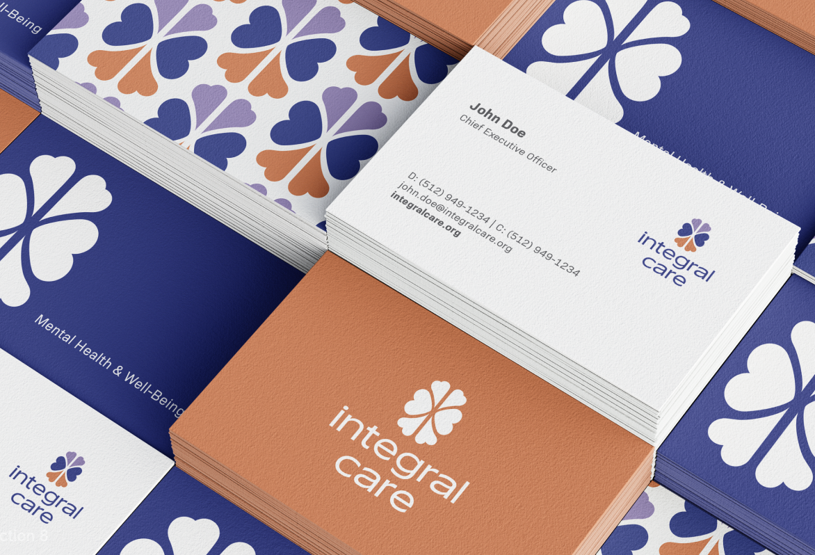
This is the kind of work Lu Hickman Creative Co. is built for. We give mission-driven organizations an identity that carries both credibility and heart, because the institutions doing the most important work deserve to look as trustworthy and as human as they truly are. For Integral Care, that means a brand that earns confidence and offers comfort in the same breath, which is what care should feel like.
FAQ
Who is Integral Care?
Integral Care provides affordable mental health services across Austin and Travis County, Texas.
What did Lu Hickman Creative Co. create for Integral Care?
A complete rebrand, including a new logo, color system, proprietary icon set, infographics, signage and environmental graphics, print collateral, merchandise, out-of-home advertising, and a full brand guideline manual.
What does the Integral Care logo mean?
It forms a brain out of hearts, representing expert mental health care delivered with genuine compassion.
What was the goal of the rebrand?
To communicate Integral Care's clinical credibility and credentials while conveying real care for people facing hardship.
What colors define the brand?
A healing purple balanced with a deep indigo and a warm orange.
Lu Hickman Creative Co. is a certified MBE/WBE boutique design and marketing agency headquartered in Houston, TX, with presence in Chicago and São Paulo, serving clients across the United States. The firm holds WBE, MBE, Hire Houston First (HHF), HUB, and SBE designations and has earned six GDUSA awards in addition to two 2025 HBMA Lantern Awards.
Services include brand identity and guidelines, capabilities brochures and sales materials, proposals and RFP design, interactive presentations, and full marketing collateral systems, all built for firms that compete in technical industries.
luhickman.com
Enjoyed this post?
Give it a like or share it with your network.